
In the world of custom manufacturing, the gap between a digital design concept and a physical product is bridged by one critical technical file: the packaging dieline. For B2B buyers, procurement managers, and brand owners in the food industry, understanding dielines is not just a design task—it is a strategic necessity. A correctly prepared dieline ensures that your custom food boxes, pouches, and containers are manufactured with structural integrity, visual precision, and regulatory compliance.
Whether you are launching a new snack brand or sourcing heavy-duty corrugated shipments for frozen goods, the dieline serves as the blueprint for both the printing press and the die-cutting machine. Errors at this stage can lead to costly production delays, wasted materials, and packaging that fails to fold or seal correctly.
This comprehensive guide explores the technical anatomy of packaging dielines, specifically tailored for food packaging applications. We will cover the essential terminology, the differences between rigid and flexible packaging templates, and a step-by-step workflow to ensure your artwork is print-ready for mass production.
What is a Packaging Dieline?
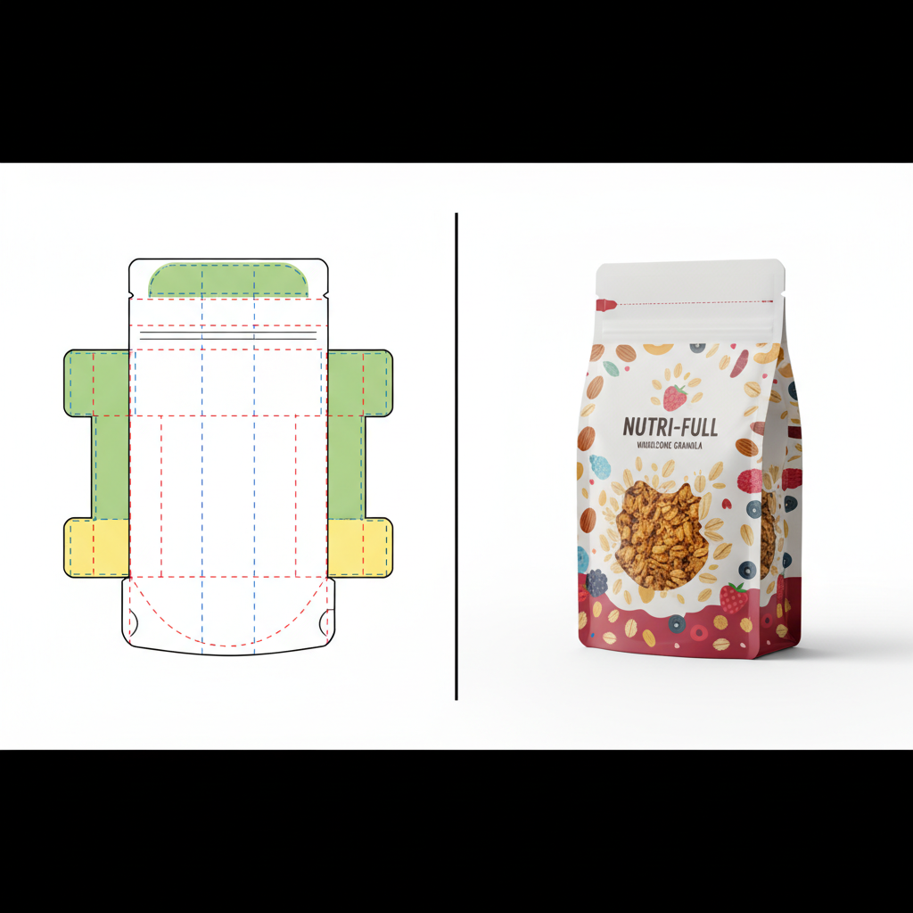
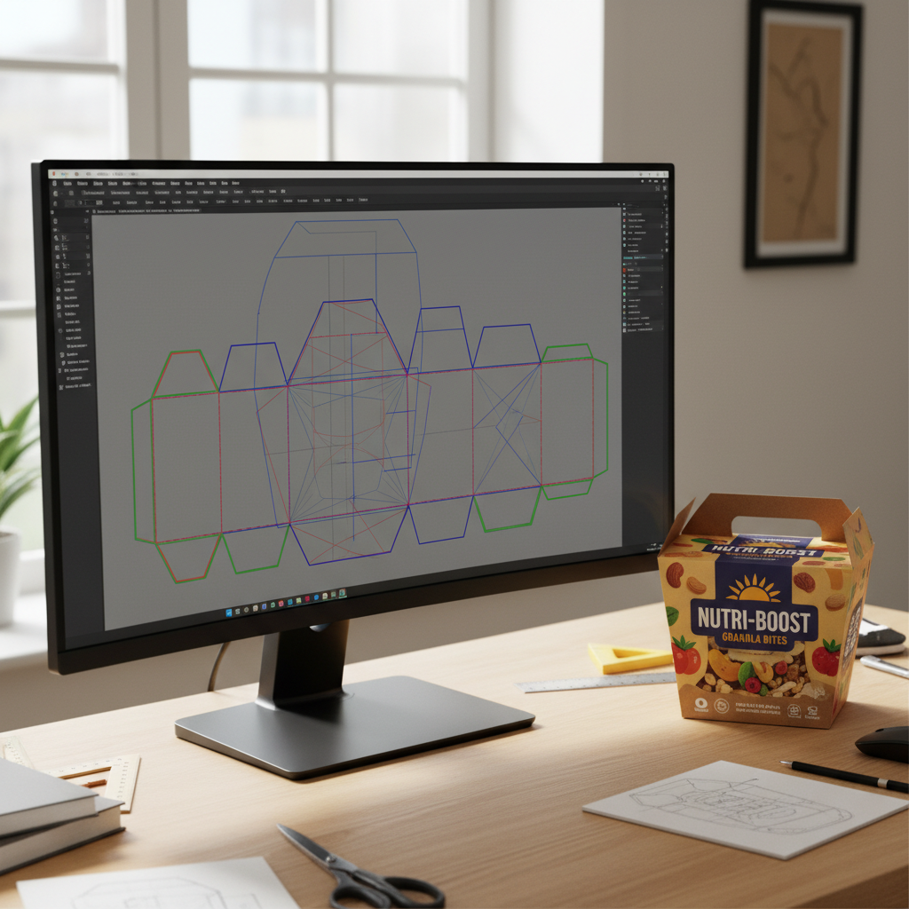
A dieline is a flat, 2D vector template that outlines the exact cut, fold, and glue lines of a packaging structure. It acts as a map for the manufacturing equipment, telling the printer where to apply ink and the die-cutter where to slice or crease the material.
Unlike a standard brochure or poster, packaging is three-dimensional. The dieline flattens this 3D shape into a 2D plane. When prepared correctly, the flat sheet folds up perfectly to form the box or bag, with all artwork panels aligning seamlessly.
The Anatomy of a Dieline
To communicate effectively with your packaging manufacturer, you must understand the standard color codes and line styles used in professional dielines. While conventions can vary slightly between factories, the following are industry standards:
- Cut Lines (Solid Lines): These indicate where the machine will cut through the material completely. This forms the outer edge of the unfolded box or the shape of a window cutout.
- Crease / Fold Lines (Dashed or Dotted Lines): These indicate where the material will be scored or indented to facilitate folding. For thicker materials like corrugated board, these lines account for the material’s thickness to preventing cracking.
- Bleed Line (Outer Guide): This line sits outside the cut line (usually 3mm to 5mm away). Artwork must extend to this line to ensure that slight mechanical shifts during cutting do not result in unprinted white edges appearing on the final product.
- Safety Zone / Safe Area (Inner Guide): Located inside the cut line (usually 3mm to 5mm inwards). All critical text, logos, and nutrition facts must stay within this zone to prevent them from being trimmed off or folded over.
- Glue Flaps / Adhesive Zones: Areas marked (often with a hatch pattern) where glue will be applied. These areas must usually remain free of varnish or ink to ensure a strong bond.
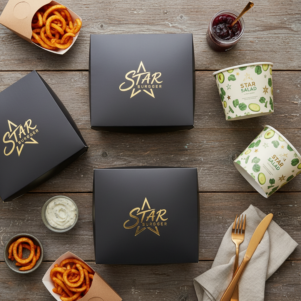
Why Dieline Precision Matters in Food Packaging
Food packaging demands higher precision than general retail packaging due to compliance, safety, and shelf-life requirements. A poor dieline doesn’t just look bad; it can compromise the product.
1. Regulatory Compliance and Legibility
Food labeling regulations (such as FDA or EU standards) dictate minimum font sizes for nutrition facts and ingredient lists. If a dieline is inaccurate, a fold line might run directly through your allergen warning, rendering the package non-compliant and unsellable. Using a precise template ensures all legal text remains in the Safety Zone.
2. Structural Integrity and Sealing
For products like food packaging bags and pouches, the dieline dictates the seal width. If artwork encroaches on the heat-seal area, the ink can interfere with the sealing process, leading to leaks. For boxes, incorrect allowances for paper thickness can cause the box to bulge or pop open on the shelf.
3. Production Efficiency
In high-volume B2B orders, efficiency is key. A flawless dieline allows for “nesting”—arranging multiple templates on a single print sheet to minimize waste. This is crucial for cost control in large runs of food packaging boxes.
Dieline Differences: Boxes vs. Bags vs. Containers
The rules of the dieline change depending on the substrate and the structure of the packaging.
Folding Cartons and Corrugated Boxes
When designing for boxes, the material thickness (caliper) is a major factor. A dieline for a thin cosmetic box cannot be used for a thick corrugated shipping box, even if the dimensions are theoretically the same.
- Panel Orientation: You must identify the Front, Back, Top, Bottom, and Side panels correctly to ensure the artwork is right-side up when assembled.
- Flute Direction: For corrugated boxes, the dieline may indicate the direction of the internal fluting, which affects structural strength.
- Interior Print: If you require printing on the inside of the box (for a premium unboxing experience), a mirror-image dieline or a separate artboard is often required.
Flexible Packaging (Pouches and Bags)
Flexible packaging involves complex distortions. When a stand-up pouch is filled, it expands, and the artwork warps slightly.
- Gussets: The bottom or side gussets need specific artwork treatment. If the background color doesn’t flow seamlessly from the front panel to the gusset, the transition will look disjointed.
- Zipper & Tear Notches: The dieline must clearly mark the position of zippers and tear notches so that logos or text are not punched out during finishing.
- Eye Marks: These are small rectangular blocks usually printed in the margin or seal area, read by sensors on the form-fill-seal machine to cut the web at the correct spot.
Rigid Containers and Sleeves
For food containers like paper bowls or plastic cups, the artwork is often applied to a conical surface.
- Warp Distortion: Artwork for a tapered cup must be curved in the flat dieline so that it appears straight when wrapped around the cup. Specialized software is often used to apply this “conical warp.”
- Sleeves: Paper sleeves for trays require precise tension allowances so they slide on easily but stay secure.
Step-by-Step: Preparing Your Artwork for Production
To ensure a smooth transition from design to manufacturing at YBJ Packing, follow this professional workflow.
Step 1: Obtain the Correct Template
Never guess the dimensions. Always request the official vector dieline from your manufacturer before starting the design. At YBJ Packing, we provide precise templates based on your custom size and material specifications. You can initiate this by visiting our contact page.
Step 2: Use Professional Vector Software
Packaging artwork should be built in industry-standard vector software, primarily Adobe Illustrator (.ai). While Photoshop is excellent for photo editing, it is not suitable for setting type or layout for packaging due to rasterization issues.
Step 3: Organize Your Layers
A professional file structure is non-negotiable. Your file should typically have three distinct layers:
- Dieline Layer (Top): Contains the cut and fold lines. This layer should be set to “Non-Printing” or a specific Spot Color that the RIP (Raster Image Processor) can ignore. DO NOT flatten this into your artwork.
- Artwork Layer (Middle): This is where your design, branding, and text live.
- Background/Bleed Layer (Bottom): Background colors and images that extend out to the bleed line.
Step 4: Color Management (CMYK vs. Pantone)
Food brands often rely on specific colors for brand recognition.
- CMYK (Process Color): Use this for photographic images and complex gradients. Ensure all images are converted from RGB to CMYK.
- Pantone (PMS / Spot Color): Use Pantone Matching System colors for brand logos and large areas of solid color. This ensures consistency across different production runs. If your design uses specific Pantones, ensure they are properly defined in the file swatches.
Step 5: Managing Images and Typography
- Resolution: All raster images (photos of food, textures) must be at least 300 DPI (dots per inch) at actual size. Low-resolution web images (72 DPI) will look pixelated and unprofessional in print.
- Outlining Text: Before saving your final file, convert all text to outlines (shapes). This prevents “missing font” errors if the factory’s computer does not have your specific typeface installed.
- Line Weight: Avoid hairline rules (lines thinner than 0.25pt), as they may not print clearly on porous materials like kraft paper.
Advanced Finishes: Foiling, Spot UV, and Embossing
If you are designing premium food packaging that utilizes special finishes, these require their own “dieline” treatment. You cannot simply indicate “gold foil” on the artwork layer.
How to set it up: Create a separate layer for each finish (e.g., “Foil Layer,” “Spot UV Layer”). Use a 100% solid spot color (often magenta or cyan) to indicate exactly where the finish should be applied. Label the swatch clearly (e.g., “Gold Foil Die”). This tells the machine exactly where to stamp the foil or apply the gloss varnish.
Common Pitfalls in Packaging Artwork
Even experienced graphic designers can make mistakes if they are new to packaging. Avoid these common errors to speed up your ordering process.
- Missing Bleed: This is the #1 error. If your background color stops exactly at the cut line, any minor movement during die-cutting will result in a white hairline at the edge. Always extend background art 3mm-5mm beyond the cut line.
- Rich Black Text: For small text, use 100% Black (K) only. Using “Rich Black” (a mix of C, M, Y, and K) for fine text can cause fuzziness if the registration is slightly off. Rich Black (e.g., C60 M40 Y40 K100) should be reserved for large solid black areas.
- Barcode Scaling: Barcodes must be high-contrast (usually black on white) and should not be scaled below 80% of their standard size, or scanners may fail to read them.
- Glue Area Contamination: Ensure that no varnish or ink is placed on the glue flaps. Ink repels glue, which will cause your boxes to fall apart.
The Proofing Process: Digital vs. Physical
Once you submit your artwork to YBJ Packing, the process isn’t over. We perform a pre-press check and provide proofs.
- PDF Proof: A digital file showing the final layout. Check this for spelling, positioning, and layer accuracy. Note that colors on screen (backlit RGB) will never perfectly match print (reflected CMYK).
- Digital Print Sample: A physical prototype printed digitally. This is great for checking size and layout but may not represent the final offset print quality or exact Pantone colors.
- Production Proof (Wet Proof): For very large or sensitive orders, a proof is run on the actual production press. This is the most accurate but also the most expensive option.
Frequently Asked Questions (FAQ)
1. Can I design my packaging in Canva or Photoshop?
We strongly advise against using Canva for final print files as it lacks the precision for bleed, spot colors, and vector die-lines. Photoshop can be used for the graphic elements, but the final assembly and text should be done in Illustrator to ensure crisp edges and proper layer separation.
2. What is the standard bleed size for food boxes?
The industry standard is usually 3mm (0.125 inches) beyond the cut line. However, for corrugated boxes or large shipping cartons, we may recommend 5mm. Always confirm with the template provided by YBJ Packing.
3. How do I represent white ink on clear plastic bags?
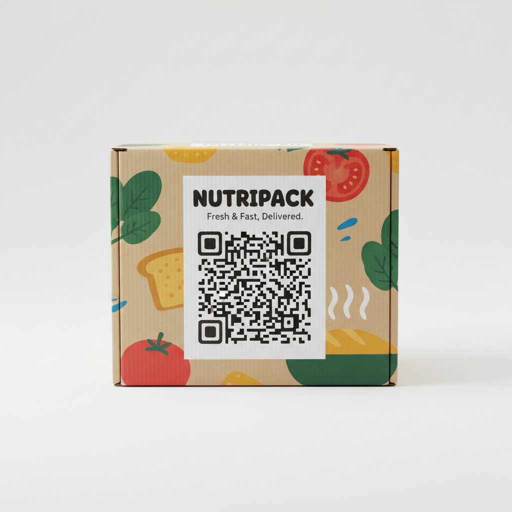
If you are printing on a clear food bag, transparent areas will show the product. If you want opaque colors, you must print a layer of white ink underneath them. You should create a separate layer called “White Plate” using a spot color to indicate where this white ink goes.
4. Why do colors look different on my cardboard box compared to my screen?
Uncoated materials (like Kraft cardboard) absorb ink, causing colors to appear darker and more muted (dot gain). Coated papers keep the ink on the surface, resulting in more vibrant colors. We recommend consulting with our team to adjust your artwork for the specific material you have chosen.
5. Do I need to include the die-line in the final PDF?
Yes, but it must be on a separate layer using a spot color. This allows our pre-press team to toggle it on to check alignment and toggle it off before burning the printing plates.
Ready to Start Your Custom Packaging Project?
Preparing artwork for custom packaging involves technical details that go beyond standard graphic design. By following these guidelines and working with precise dielines, you ensure that your food packaging protects your product, complies with regulations, and stands out on the shelf.
At YBJ Packing, we support our clients through every step of the process, from structural engineering to final print. Whether you need custom printed food boxes, flexible pouches, or rigid containers, our team is ready to provide the templates and guidance you need.
Don’t leave your brand to chance. Contact us today to request a dieline template or get a quote for your next project.