
The Critical Role of Color in Food Branding
For food brands, packaging is often the first physical interaction a customer has with the product. Whether it is a frozen food box in a supermarket freezer or a takeaway bag handed over a counter, the colors on that package communicate flavor, quality, and brand identity. However, achieving that perfect shade of “strawberry red” or “organic green” is a technical challenge that relies heavily on the printing method chosen.
One of the most frequent questions procurement managers and brand owners face when finalizing artwork for production is: Should we use CMYK or Pantone?
The answer affects not just the visual consistency of your packaging but also the production costs, minimum order quantities (MOQs), and lead times. Understanding the technical differences between these two color models is essential for making informed purchasing decisions for wholesale packaging.
At YBJ Packing, we guide clients through these technical specifications daily. This guide provides an in-depth look at CMYK versus Pantone printing specifically for food packaging applications, helping you balance budget, brand fidelity, and manufacturing feasibility.
Defining the Contenders: CMYK vs. Pantone (PMS)
What is CMYK (Process Printing)?
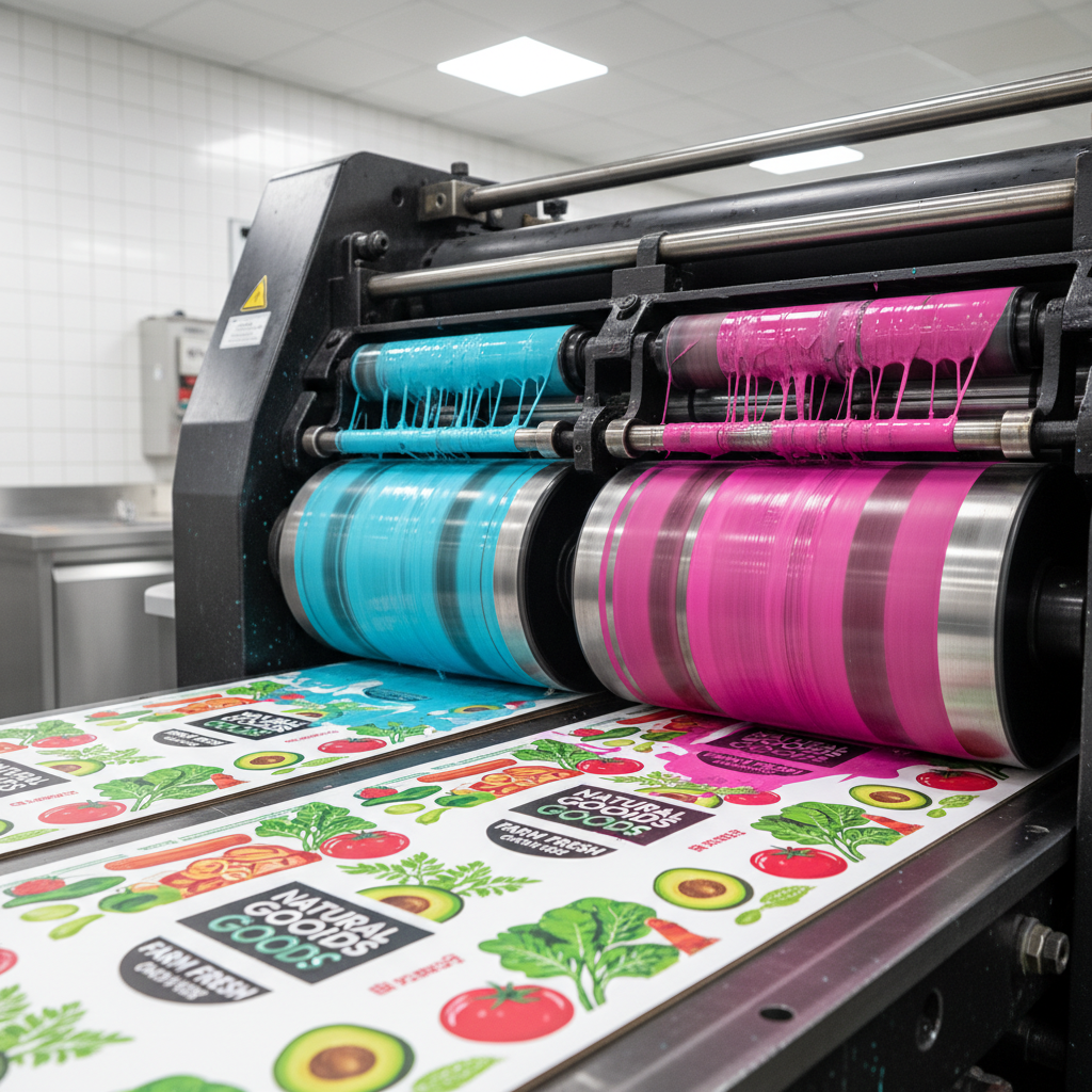
CMYK stands for Cyan, Magenta, Yellow, and Key (Black). It is the standard color model used in full-color printing, often referred to as “four-color process” or simply “process printing.”
How it works:
Instead of mixing inks before they hit the paper, the printing press applies tiny dots of these four colors in overlapping patterns. To the naked eye, these dots blend together to create a wide spectrum of colors. For example, a field of green grass in a photo is created by printing yellow and cyan dots close together.
Primary Use Case:
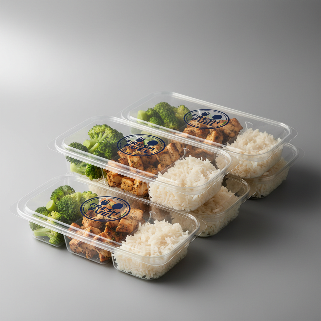
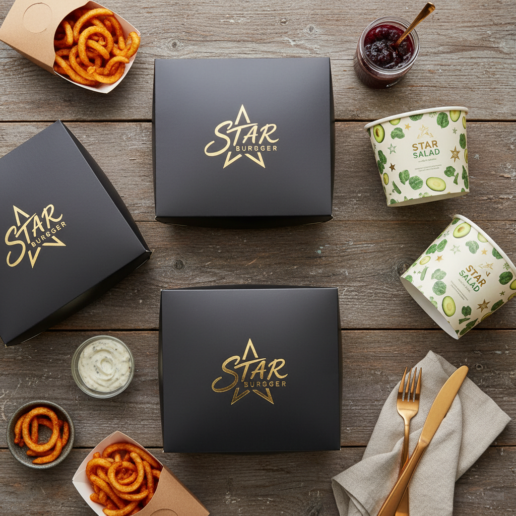
CMYK is the industry standard for printing photographic images, multi-colored illustrations, and complex gradients on food packaging boxes. If your design includes a photo of a pizza or a burger, CMYK is required to reproduce the realistic variations in cheese, crust, and toppings.
What is Pantone (Spot Color)?
Pantone, or the Pantone Matching System (PMS), utilizes pre-mixed inks. Just as you might buy a specific bucket of “Navy Blue” paint for a wall, a Pantone ink is mixed to a precise formula before it is loaded into the printing press.
How it works:
Because the ink is pre-mixed, it provides a solid, uniform block of color. It does not rely on optical blending. The color you choose from the Pantone swatch book is exactly the color that appears on the substrate (subject to material interaction).
Primary Use Case:
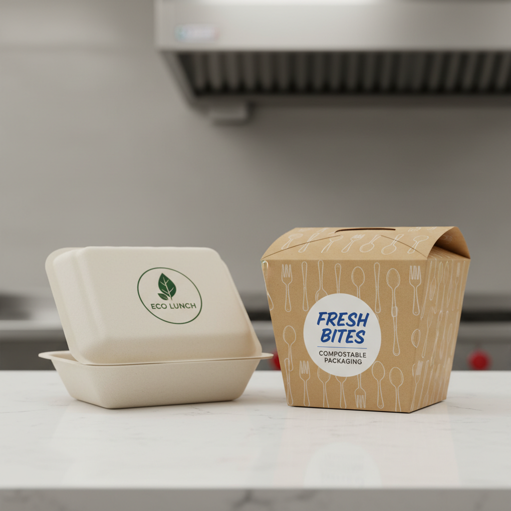
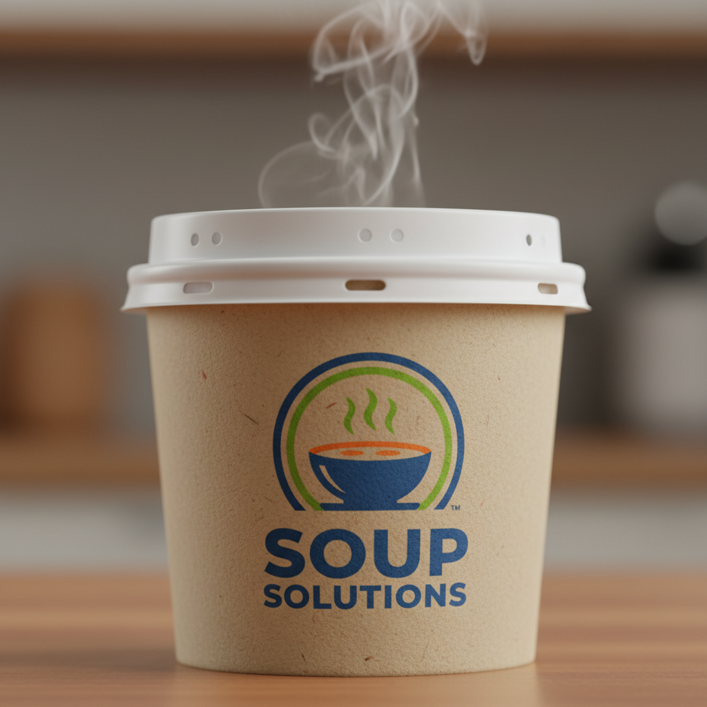
Pantone is ideal for brand logos, specific brand colors (e.g., Coca-Cola Red or Starbucks Green), and designs requiring high color consistency across different print runs and materials. It is widely used on food packaging bags where simple, bold branding is preferred over photographic imagery.
Comparative Analysis: Cost, Consistency, and Capability
To make the right choice for your supply chain, you must weigh the tradeoffs. Here is a detailed breakdown of how these methods compare in an industrial packaging context.
1. Color Accuracy and Consistency
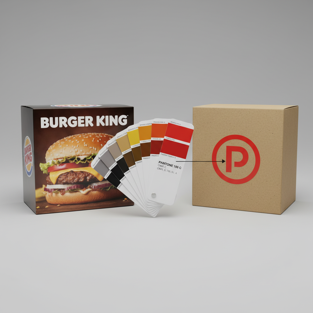
- Pantone (Winner for Consistency): Pantone is the gold standard for accuracy. Because the ink is mixed to a specific formula, the color remains consistent from run to run. If you order 10,000 burger boxes today and another 50,000 in six months, Pantone ensures the red background looks identical.
- CMYK (Variance is Expected): Because CMYK relies on the overlap of four different ink plates, slight shifts in registration (alignment) or ink density can alter the final color. A 5% shift in Cyan can make a “Warm Red” look slightly brownish or purple. While modern presses at YBJ Packing are highly calibrated, slight variances (Delta E) are inherent to the process.
2. Production Costs
- CMYK (Winner for Small Batches & Photos): For designs with many colors or photos, CMYK is more economical. You only need four printing plates (C, M, Y, K) to produce thousands of colors.
- Pantone (Winner for Simple 1-2 Color Jobs): If your design is just a logo on a brown kraft box, using 1 or 2 Pantone colors can actually be cheaper than setting up a full 4-color CMYK process. However, if you want a photo (CMYK) plus a specific brand logo (Pantone), you are now paying for 5+ stations on the press, which increases setup costs significantly.
3. Color Gamut (Range)
- Pantone: The Pantone system includes colors that CMYK simply cannot reproduce, such as bright oranges, neon/fluorescents, and metallics (gold, silver). If your food packaging relies on a vibrant neon green to signal “lime flavor,” CMYK will likely result in a duller, muddier approximation.
- CMYK: While versatile, the CMYK gamut is limited. It struggles particularly with bright oranges and navy blues.
Material Interactions: The Substrate Factor
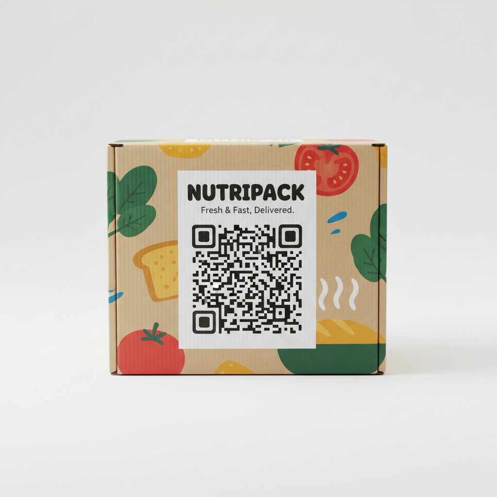
In B2B packaging procurement, the material (substrate) you choose has as much impact on the final color as the printing method. Food packaging utilizes a diverse range of materials, from coated ivory board to porous kraft paper.
Coated vs. Uncoated Surfaces
You will often see Pantone codes followed by a “C” (Coated) or “U” (Uncoated). This distinction is critical.
- Coated Paper (e.g., Ivory Board, Art Paper): Ink sits on top of the surface. Colors appear vibrant and sharp. This is typical for high-end cosmetic-style food boxes or frozen food sleeves.
- Uncoated Paper (e.g., Kraft, Standard Corrugated): Ink soaks into the fibers. Colors spread (dot gain) and appear darker and less saturated. A Pantone Red printed on white coated board will look bright; the same ink on brown kraft paper will look dark and rusty.
Buyer Tip: When ordering custom food containers made of kraft material, do not rely on the color you see on your computer screen. Always request a physical proof or reference a Pantone Uncoated book.
Plastic and Flexibles
For flexible packaging like pouches or barrier films, the printing process is often Rotogravure or Flexography. Here, Pantone (Spot) colors are extremely common because they provide excellent coverage and opacity, which is necessary when printing on transparent or metallic films used for snack foods.
Strategic Decision Making: When to Use Which?
Based on our experience manufacturing for global brands, here is a decision framework to help you choose.
Choose CMYK If:
- You have photographic imagery: You are selling a frozen meal and need to show the cooked dish on the box.
- You have complex gradients: Your design fades from yellow to red to blue seamlessly.
- Budget is the primary driver for a multi-color design: You have a colorful pattern with 10+ distinct shades. Printing this in Spot colors would require a 10-station press, which is prohibitively expensive. CMYK does it with 4 stations.
- Small runs (Digital Printing): For very small orders (often below offset MOQs), digital printing is used, which is strictly a CMYK process.
Choose Pantone If:
- Brand consistency is non-negotiable: You are a franchise and your logo must look exactly the same in Tokyo as it does in New York.
- You use special effects: You need metallic gold for a premium chocolate box or a fluorescent color for candy packaging.
- Minimalist design: Your design is simply dark blue text on a white box. Printing 1 spot color is cleaner and sharper than using 4 plates to build a composite blue (which risks fuzzy text if registration is slightly off).
- Coverage consistency: You need a large solid background color (e.g., a completely purple box). CMYK solid backgrounds can sometimes show banding or inconsistency; Pantone provides a smooth, solid laydown of ink.
Technical Specifications for Packaging Artwork
To ensure your order proceeds smoothly through the manufacturing line at YBJ Packing, your design files must be set up correctly. Handing over the wrong file type is the #1 cause of production delays.
1. File Formats
- Vector (AI, PDF, EPS): Preferred for text and logos. Vector files can be scaled infinitely without losing quality and are easily separated into Pantone plates.
- Raster (PSD, TIFF, JPG): Required for photos. Must be high resolution (minimum 300 DPI at actual print size).
2. Converting Colors
If your designer created a logo in RGB (screen mode), it must be converted to CMYK or Pantone before printing. Warning: This conversion often shifts colors significantly. Bright RGB blues often turn purple-ish in CMYK. It is vital to approve these conversions during the digital proofing stage.
3. Black Text
For nutrition labels and ingredients lists on food boxes, ensure text is 100% Black (K), not “Rich Black” (a mix of C, M, Y, K). Using Rich Black for small text can cause fuzziness if the plates are not perfectly aligned.
The Manufacturing Process: From File to Finished Box
Understanding the factory floor process helps in setting realistic expectations for timelines and quality.
Step 1: Pre-Press and Platemaking
Once you submit your artwork to our team, we analyze the color separation. For CMYK, the image is broken down into four plates. For Pantone, a separate plate is made for each spot color. If you have a design with CMYK photos + 2 Pantone logos, that requires a 6-color press.
Step 2: Ink Mixing (Pantone Only)
For spot colors, ink technicians mix the ink manually or using automated dispensers to match the specific PMS number. This ink is tested on the specific substrate (paper/plastic) to verify the shade, as the material color affects the final look.
Step 3: Printing and Drying
Food packaging inks often require specific curing considerations, especially for low-migration compliance (ensuring ink does not leach into food). Whether using UV curing or water-based coatings, the drying time can vary depending on ink coverage.
Step 4: Quality Control
During the print run, operators use densitometers and spectrophotometers to measure color accuracy. However, human visual inspection remains crucial. We check for registration issues (blurriness), hickeys (dust spots on plates), and color consistency from the first sheet to the last.
Buying Guide: Navigating MOQs and Sampling
When you are ready to order wholesale food packaging, keep these logistical factors in mind regarding color.
Minimum Order Quantities (MOQ)
Custom printing involves significant setup. Mounting plates, washing ink stations, and calibrating the press takes time and wastes material (make-ready waste).
Consequently, highly complex print jobs (e.g., 6-color jobs with CMYK + Pantone) may have higher MOQs to justify the setup cost. Simple 1-color flexo printing on bags often allows for more flexibility.
Sampling: The Proofing Dilemma
Buyers often ask: “Can I get a single sample box printed exactly like the final run?”
- Digital Proofs: Usually free or low cost. Good for checking spelling and layout. Not accurate for color matching, as digital printers use toner/inkjet, not offset ink.
- Wet Proofs (Press Proofs): The factory sets up the actual printing press for one unit. This is expensive (often costing hundreds of dollars) because it incurs the same setup labor as a full production run.
- The Compromise: We typically recommend a digital proof for layout and using physical Pantone books or standardized color charts to agree on color expectations.
Sustainability in Printing
Modern food brands are increasingly concerned with sustainability. The choice of printing impacts eco-friendliness.
- Soy and Vegetable Inks: YBJ Packing utilizes vegetable-based inks where possible, which are more renewable than petroleum-based alternatives.
- De-inking: For recycling, paper needs to be “de-inked.” Standard CMYK and Pantone inks are generally compatible with recycling streams. However, heavy metallic inks or excessive UV coatings can complicate the recycling process for paperboard.
FAQ: Common Questions on Packaging Printing
1. Can I use both CMYK and Pantone on the same box?
Yes, this is very common. It is called “5-color” or “6-color” printing. Brands often use CMYK for product photos and a Pantone spot color for their logo to ensure brand recognition. Note that this requires a printing press with enough stations and will slightly increase the cost.
2. Why does my printed box look different from my computer screen?
Screens emit light (RGB) and can display millions of bright colors. Paper reflects light (CMYK/Pantone) and has a smaller color range. Additionally, screen calibration varies wildly. We never recommend approving color based solely on a monitor; always use a physical color book.
3. Is Pantone printing safe for food packaging?
Yes, provided the correct inks are used. For direct food contact (where food touches the printed surface), special certified inks and barrier coatings are required. Typically, printing is done on the outside of the box or bag, with a barrier layer protecting the food inside. Always inform us if your packaging requires direct food contact.
4. Does the number of colors affect the price?
In offset and flexographic printing, yes. Each color requires a separate plate and setup. A 1-color design is cheaper than a 4-color design. However, in digital printing (used for very short runs), the number of colors usually does not impact the price per unit.
5. What is the difference between C, U, and M Pantone suffixes?
C = Coated: For glossy or matte coated papers.
U = Uncoated: For kraft, standard paper, and uncoated cardboard.
M = Matte: Less common, for matte coated paper.
When designing for a kraft burger box, you should select colors from the Uncoated (U) book to get a realistic expectation of the final duller, absorbed look.
6. How do I order custom printed packaging from YBJ?
The process is straightforward. You provide your dimensions, material preference, and artwork (or logo). We analyze the design to determine if CMYK or Pantone is best for your budget and quality goals. You can start by visiting our How to Order page.
Conclusion
Choosing between CMYK and Pantone is not just a design choice; it is a strategic business decision that impacts your brand’s shelf presence and your bottom line. While CMYK offers versatility for photographic designs, Pantone delivers the unmatched consistency required for strong brand identity.
At YBJ Packing, we specialize in high-quality custom food packaging that meets international standards. Whether you need a complex 6-color pastry box or a minimalist 1-color kraft bag, our engineering team is ready to optimize your print production.
Ready to elevate your food brand? Contact us today for a consultation or request a quote for your custom packaging project.